Analysis of posters
The Football Factory
The visual codes within the image suggest violence as the men have their fists clenched and
look to be in various fighting stances. They are coming out of the poster towards the audience which is intimidating and threatening, indicative of the genre.There is also what looks to be blood
splatters along the bottom of the page which again conveys the theme of
violence.
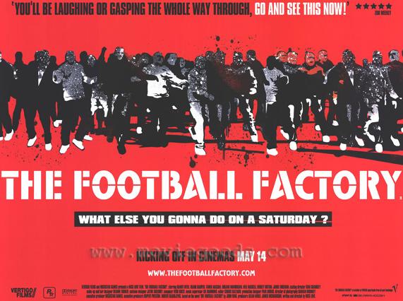 The Font for
the title “THE FOOTBALL FACTORY” is all in capitals and with bars through the
letters. This could be to suggest the lines on a football pitch but also the
bars could suggest prison which is where they could end up if the characters
continue to carry out hooliganism. The white colour of the font is used because
it stands out against the red, The colour of the font could also suggest broken
bones harking back to the film's theme of violence.
The Font for
the title “THE FOOTBALL FACTORY” is all in capitals and with bars through the
letters. This could be to suggest the lines on a football pitch but also the
bars could suggest prison which is where they could end up if the characters
continue to carry out hooliganism. The white colour of the font is used because
it stands out against the red, The colour of the font could also suggest broken
bones harking back to the film's theme of violence.
The main colour on the
poster is red both because it is catches people’s eyes and also the
connotations it has with violence, danger and blood.
The tagline
“what else you gonna do on a Saturday?” references the time which most matches
are played however the tagline suggests that fighting is the only thing to do
on Saturdays, this again gives the audience an insight in to the lives of the
characters but also the narrative. The mode of address is informal using slang to further suggest the genre and themes of the film. This may also resonate with the target audience.
Overall this
poster successfully portrays the message of the film's narrative both through
the main image and the colours used. The tagline is also very clever in that it
summarises the feelings of the characters in the film in one simple sentence.
Overall this poster successfully sells and markets the film.
Green Street Hooligans

The
purpose of this poster again is to put across the genre, themes and narrative of the
film. The main image shows the main characters in the film, with the two most
important characters, which the film focuses most on positioned at the front of
the shot. The character's facial expressions show anger and violence which
reflects the genre and nature of the film. There is a clear hierarchy established through the layout and design with the lesser characters at the back.The overall colour scheme for this poster
is dark and bleak looking this gives off a rough and raw impression which again
helps suggest the genre and narrative of the film. The main source of light focuses on the characters and their mode of address is direct. The film poster is also constructed to look beaten and folded which also reinforces the rough nature of the film.
The tagline “stand your ground” looks to
be sprayed on the wall behind the characters, this gives the poster more of an
edgy feel and has connotations of aggression and tension. The line it’s self
“stand your ground” again puts forward the themes of violence and confrontation. Overall I feel that this poster successfully puts forward the narrative and themes of the film.
“stand your ground” again puts forward the themes of violence and confrontation. Overall I feel that this poster successfully puts forward the narrative and themes of the film.
Lock Stock and Two Smoking Barrels
 The poster shows the film to be quite violent with the shotgun being the predominate image. However the poster is very clever in that it creates a sense of enigma as it makes the audience want to watch the film in order to find out who the four characters are positioned on top of the gun. The fact that they are positioned on top of a gun also gives us an insight in to the story as it suggests they may be in some kind of trouble, this could also include the bag that one of the characters is holding. However, they are silhouettes, reinforcing the enigma.The tagline "A disgrace to criminals everywhere" suggests that the crime the characters have committed is amateur and poorly done which gives the film a comedy element.
The use of bold masculine colours such as red suggests that the film is aimed at a predominantly young male audience. The use of the colour red highlights the shotgun which brings with it connotations of death and danger. The colour white is used to highlight the characters silhouettes but also the finger on the trigger. The finger on the trigger suggest that the characters are not in control of the action, reinforcing the tagline.
The title "Lock Stock and Two Smoking Barrels" references a shotgun which again suggests that a shotgun may have a big role in the film and has generic associations. The title is written in quite a cartoon style font which conveys that there may also be a comedy element to the film.
Overall I think this poster is very effective as it cleverly puts across the themes and genre of the film without giving away too much. It also creates a sense of enigma with the use of the silhouettes. The poster works as a teaser for the film as the audience are not given any information about actors, the focus of the appeal is the genre.
Oli
ReplyDeleteYou have deconstructed three posters, relevant to your chosen genre. You have used key media terminology, discussing posters in terms of their composition of the posters, as well as referring to the connotations of the images, use of colour etc.
Gary